On natural decorating
Posted on Nov 21, 2023
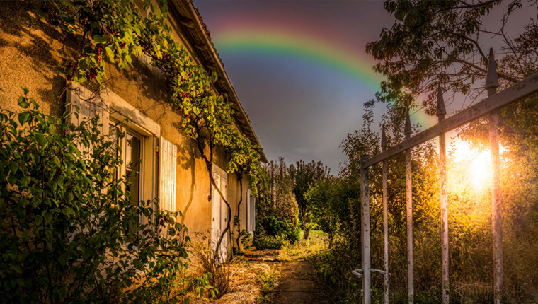
Photo: “Time spent amongst trees is never wasted time.” – Katrina Mayer, Tadej Turk.
Bonjour/Hello, you will, no doubt, be delighted to learn that the painting of the dining room is progressing as it should. We have completed one and a half walls. And already I can see and, more importantly, feel the difference. Yes, the pink has grey in it, but actually that’s a good thing. The room feels brighter and warmer and less sadly oppressive, which is all the more remarkable considering that we have had nothing but glowering skies, wet rain and wild wind for the past five weeks. Of course, I always knew the pink would be perfect…
Making a start on painting the house has perked me up no end. The house is now, finally, beginning to feel like my home. Only now am I beginning to feel connected to it. This despite having put up and put out my pictures, ceramics and glass. And having lived here for a year.
Moving to a new home, moreover in a new country, was always going to be unsettling. This I knew. I had thought that I had prepared myself for it. And which is why I put up and put out my pictures, ceramics and glass almost as soon as I arrived. I hadn’t anticipated just how oppressed I would feel living with a colour that bothered me so. For there is nothing wrong with the grey per se. There is, after all, no such thing as the wrong colour… just a colour in the wrong place, a subtle but distinct difference I think you will agree. What works well in a northerly urban setting often does not translate to a southerly rural one.
The key, I find, to choosing colour in tune with your surroundings is simply to look through the window. Or better yet, actually go outside. Yes, there are greys here, most obviously in the stone buildings. But if you look closely at the stone, there is also pink, a delicate hint of purple, and subtle tones of yellow and brown, orange and ochre. Then there are the reds of the terracotta roof tiles, not to mention the Titian-red coat of the enterprising squirrel; the myriad of greens and browns of the fields and of the woods; the blues of the sky, of the flash of a jay’s wing, of the iridescent plumage of the luckless pheasant; the deep, velvet blue-black of the night; and, in summer, the yellows of the rape and of the sunflowers.
The house rests contentedly in place, even on a dreary winter’s day. It rests contentedly in place because it is of this place… of the stone and the earth and the woods. Madame R, the last owner but one, understood this when she created her gloriously colourful garden.
Nature has painted the Earth with every conceivable colour under the sun. She has never been known to use colour inappropriately. So I don’t understand why interiors described as “natural” or a “treat for the senses” are so lacking in colour. Nothing could be more unnatural in my view. Vision, colour vision, is our primary sense after all.
In decorating our home, my plan is to do nothing more than bring the outside inside. I take as inspiration this gorgeously natural farmhouse in Umbria by Retrouvius.
There might yet be some grey… perhaps.
A bientôt

________________________