On completion
Posted on May 23, 2023
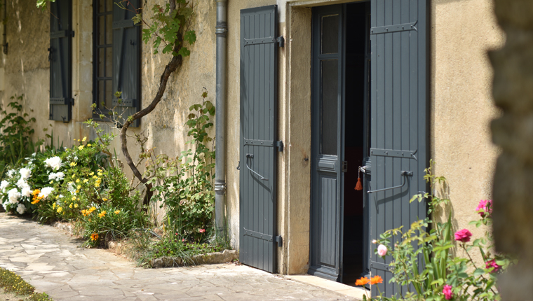
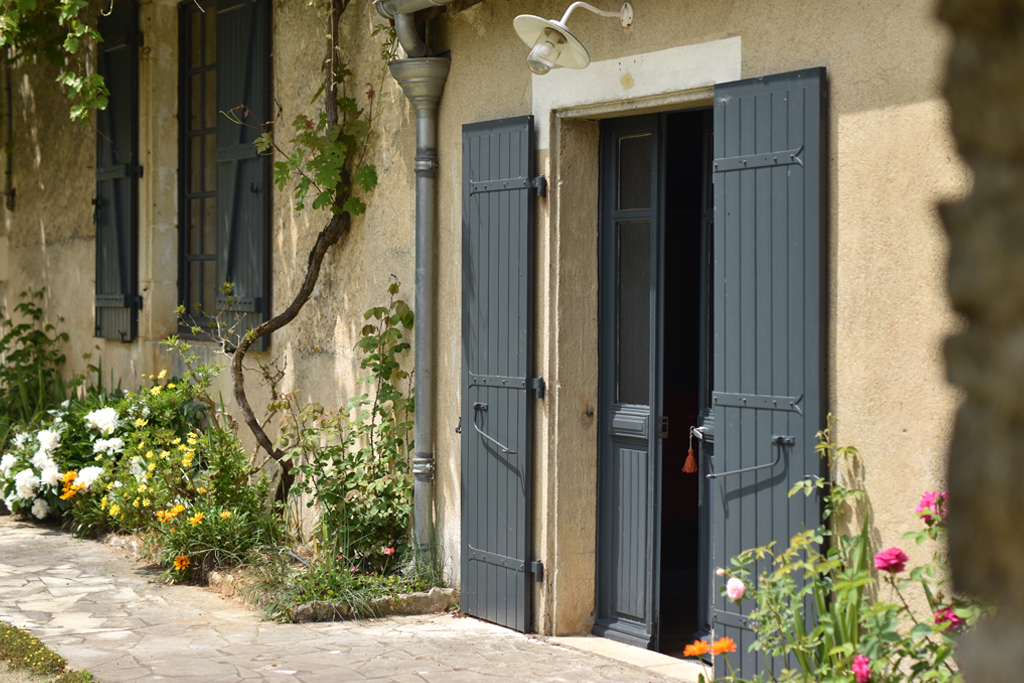
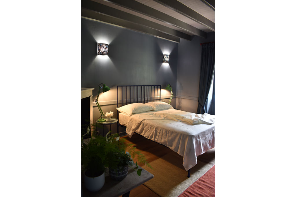
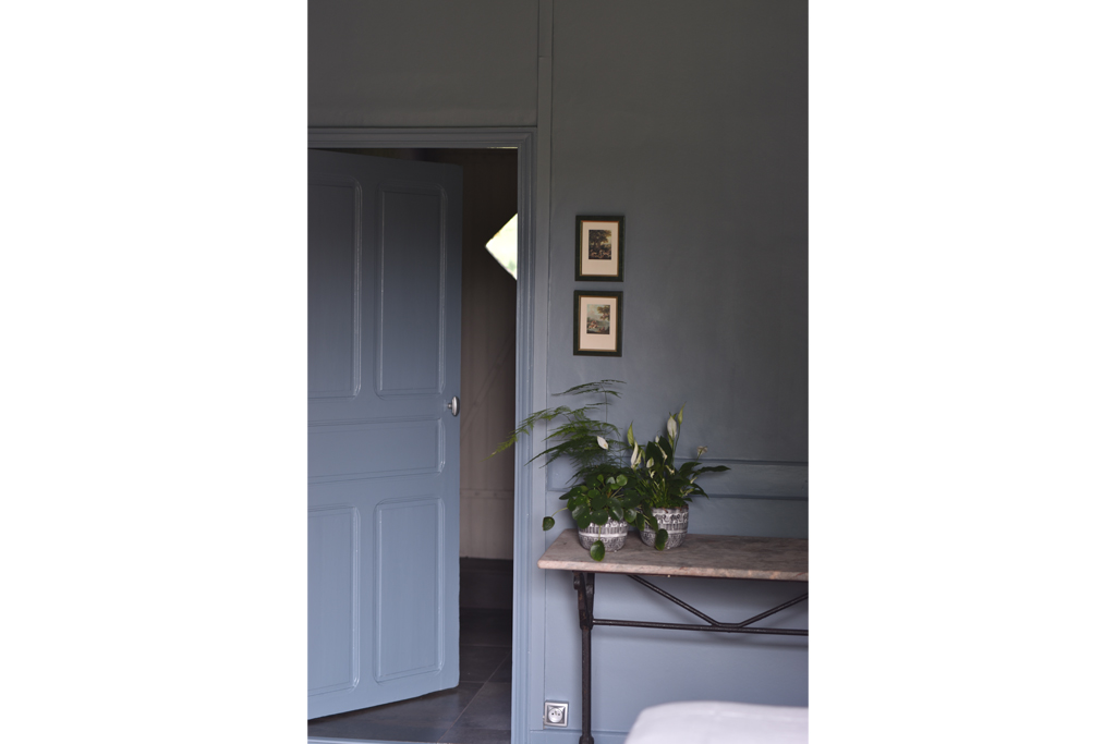
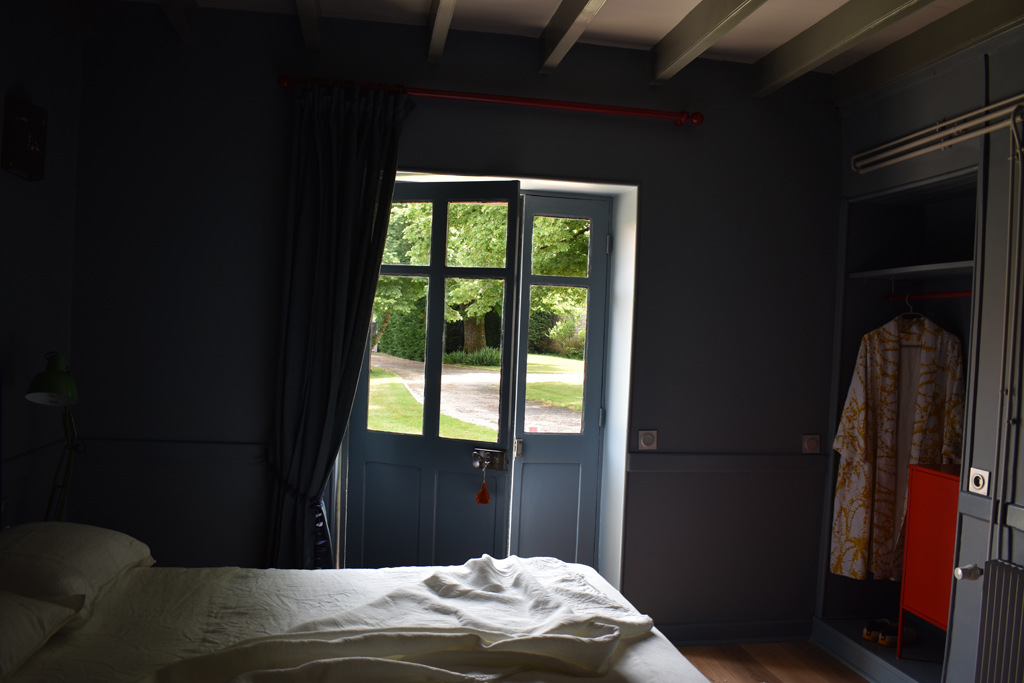
Photo: Do come in... the entrance to the finished room. The Boyfriend
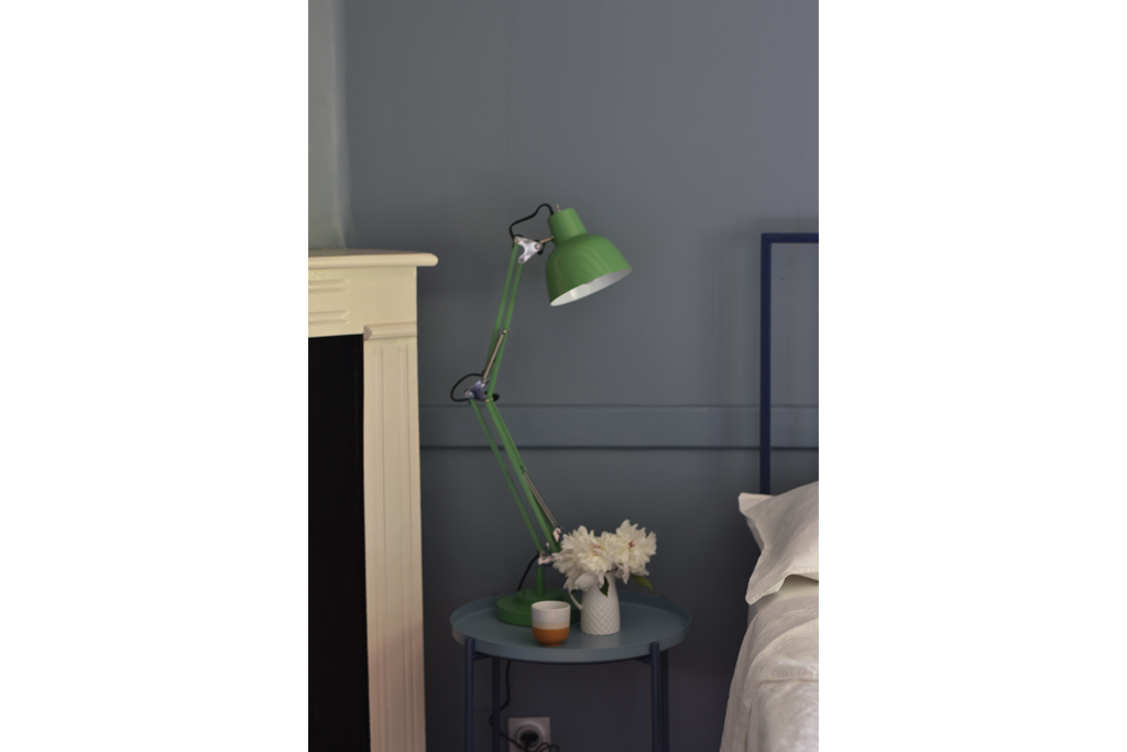
Hello/Bonjour, here it is… ta da… in all its glorious blueness and blue gloriousness. Do come in. See, there’s quite a lot of it. Blue I mean. And other colours too. I am delighted with how it’s turned out… for as you well know, there were many moments of doubt. Translating a decorative scheme from Gwyther Irwin’s (1931-2008) striking print Royal Parade and my own O, it’s Magic Cardamom proved to be both easier and more difficult than I had imagined. Green, you see, green was needed. Once I happened upon green reading lights at our local DIY store, all fell into place. That, and coming to terms with the fact that blue is definitely my colour.
I am also very well pleased that I didn’t have to spend much money on the renovation. The most expensive element was the paint. I am a firm believer in buying the best paint you can afford. I love Farrow & Ball paints, for their “dirty” colours, for their depth of pigment, for their timeless elegance, and for their longevity. This beautiful blue is Selvedge. It also helped that I resolved the work with the grey as best I could, while at the same time getting rid of most of it. Still, it involved a lot of sanding and painting, and painting and sanding, and swearing. Worth it though I think.
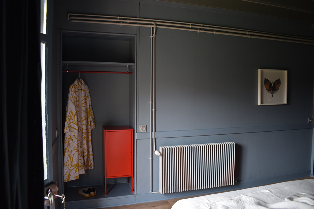
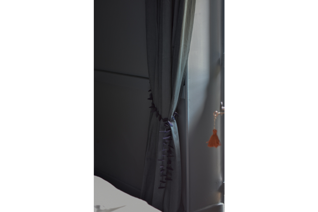
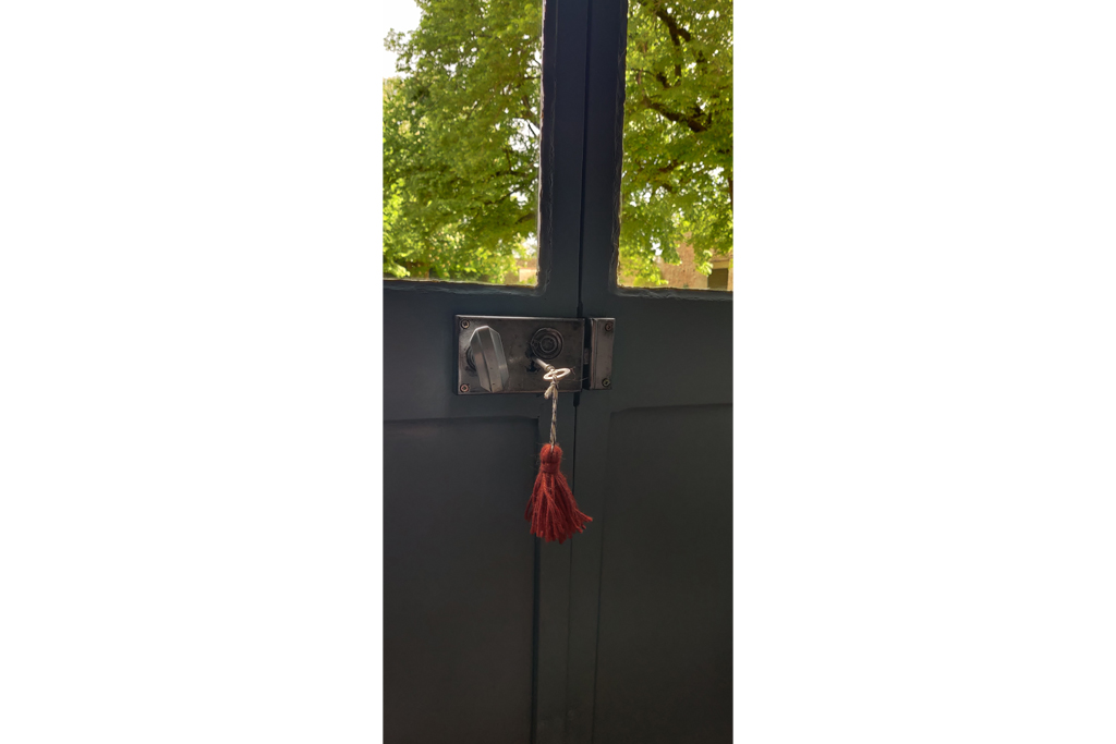
The wall lights were given a new lease of life by the insertion of my Harlequin 4 fabric in an archive colourway; the marble-topped table unearthed at our local brocante where it had been mired under a teetering mound of stuff and several centimetres of dust; the pots in the fireplace, the fortunate junk shop finds of my late uncle. I took a paint brush to the old (grey!) curtain pole and to the clothes hanger, for pops of cherry red were absolutely necessary; a necklace became the curtain tie-back; and the Boyfriend inculcated me into the fine art of tassel making. Really, there is no end to his talents.
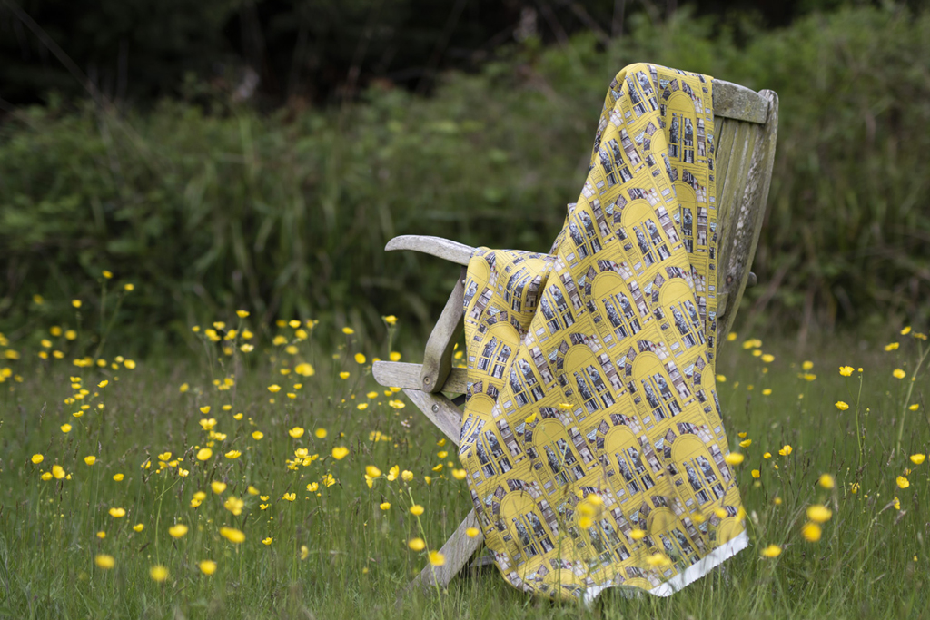
My romance with the IKEA Gladom table, and my love of a bargain, meant I already had the bedside tables, uncannily in the appropriate blues. The blue bed has finally come into its own. All that’s missing is the yellow chair… another brocante bargain and a work in progress, the seat soon to be covered in Okno.
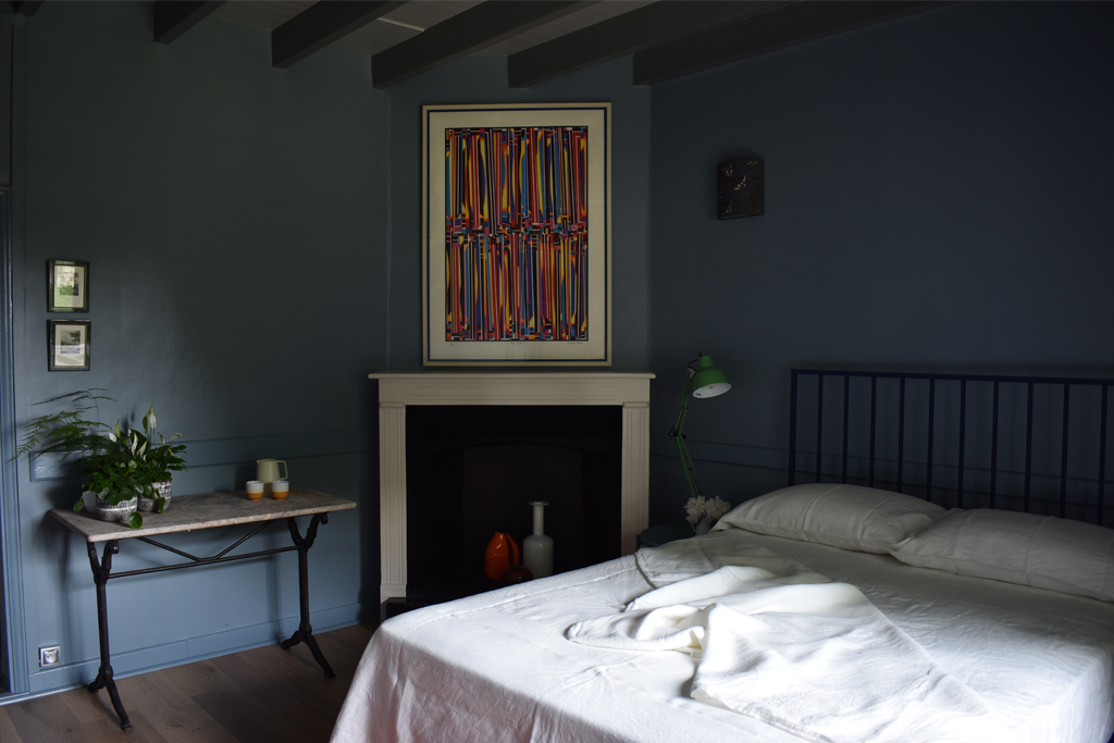

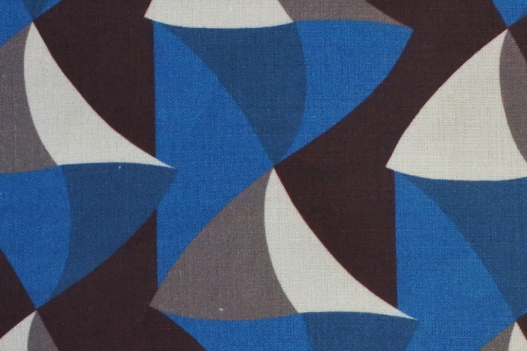
Perhaps at first glance such a commanding artwork and my textile were an unlikely starting point for the final scheme. The secret, I find, is to take one element from each and use that as the base, in this case the colour blue. I then introduced pops of accent colours and ensured that they were repeated around the room for balance and to create an engaging tension between the artwork and the rest of the space. O, it’s Magic Cardamom informed the accent colours I chose. In this way, the artwork becomes part of the decorative whole, rather than simply a painting on a wall.
And now, a short break before I tackle the next of the grey rooms…
A bientôt