
Bonjour/Hello, I am sorry to report that the Boyfriend and the enterprising squirrel have fallen out. He is not at all swayed by her beautiful Titian-red coat, cute tufty ears and engaging way of bouncing across the lawn. For we have lost count of the number of walnut saplings we (well, mainly he) have had to dig out of the flowerbed in front of the house. And we have yet to tackle the rather large copse she has planted down by the gate. We could very easily go into the walnut sapling selling business. After all, diversification is good, especially as I am still pondering the structure of my textile business here.
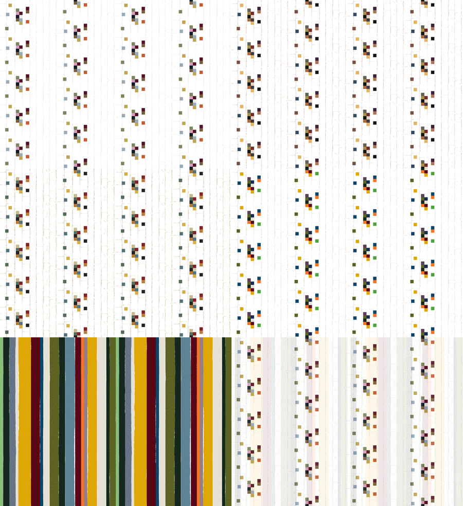
That’s not to say that I’ve not been busy. It’s a dangerous thing to have a hiatus… and time. Time to “mess with designs already done,” as the Boyfriend says. “Mess” in this case is of course a technical term. The latest, and final, design to benefit from being messed with is Hopscotch. Stripe has a new invigorating colourway. And I’ve been working on a design with a very talented young artist with a fantastically logical mind. The starting point was a complex 3D shape she created. The design has a lot of energy on the render and it will be interesting to see how this translates into the final print. More on this later as it deserves a Musing all to itself.
The renovation of the bedroom continues… I would like to say apace, but not really. The walls have now been fully stripped and repaired. The woodwork has been sanded. But, oh my word, the dust. The dust. I had quite forgotten about the dust. It took me the best part of an afternoon to banish the dust and clean down the walls. Only to discover all the bits I’d missed when sanding. Argh! Cue more sanding and cleaning. The poor vacuum cleaner coughed and sputtered and refused to work. It’s still awaiting reassembly. I consoled myself by sitting in the sun. And dreaming up colour schemes for the rest of the house. You see, there is the thorny issue of blue.
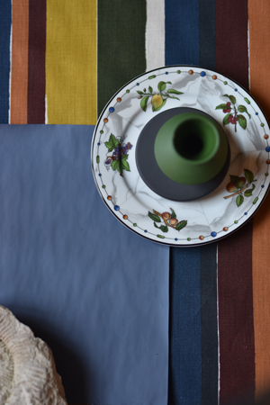
Having made it very clear that blue is not my colour, I have… whisper it, decided to paint the Salon blue. This decision has not been without my usual toing and froing. There is nothing more wrong than the wrong blue. But this is not just any old blue you understand. For I have fallen for Farrow & Ball’s Wine Dark. An intoxicatingly deep blue. A blue inspired by midnight skies and named for Homer’s description of the sea. Perhaps the perfect blue for me. Oh, I’m feeling quite lyrical about this. So it must be the right choice. That it has “wine” in its name is purely coincidental I assure you.
This gorgeous blue also has the benefit of creating a conversation with what I thought were black and white tiles in the kitchen, but no, now that the light is better, I can see that they are a deep blue and white. It’s always nice when a longing for a particular colour turns into a considered design decision. Flow is important and I did have a small worry that a blue Salon would sit incongruously with my other colour choices for the perfect house.
I shall, in future, be more forgiving of blue. After all I seem to have inadvertently surrounded myself with quite a lot of it… though in my defence my artwork looked less blue in the Flat. I blame the grey.
A bientôt

If you would like Musings to pop into your inbox every month, you can subscribe here.