It is a truth universally acknowledged, dear peoples, that blue is relaxing. After all, blue light has been found to lower blood pressure, and red light to raise it, so of course blue must be universally calming. But it’s the blue light of dawn that gets us up in the morning. And the blue light of screens that keeps us from getting a good night’s sleep. That doesn’t seem very relaxing.
Perhaps we think blue is relaxing because we associate it with calmness. As we expect to feel calm in the presence of blue, we do. The expectation effect is a powerful thing. But researchers have found that people are objectively more impulsive under blue light, while subjectively reporting feeling more impulsive under red light. Hmmm… that’s unexpected.
“Light is a thing that cannot be reproduced, but must be represented by something else – by colour.” – Paul Cezanne
In the world, as in our brains, we use colour as a proxy for light. Essentially, what we are trying to do is to replicate the effects of light, as we perceive it, using pencils and paint, dyes and pixels. But colour of course does not exist in isolation. It’s always attached to something. Many somethings. We see the colour and everything we associate with it. We carry a lot of colourful baggage around in our heads. Even, or perhaps especially, if we wear nothing but black.
“We do not see things as they are, we see them as we are.” – Anaïs Nin
Boy, if that isn’t complicated enough, a colour can be one thing alone and quite another when in company. As Hella Jongerius says, “a colour only becomes a colour because it has neighbours.” Season, situation, texture, time of day, lighting conditions, proportion, context, and our culture all have a bearing on how we perceive a colour. And what of the estimated 12% of women with tetrachromacy, who see 100 times more colours than the rest of us. What an amazingly colourful world they must inhabit.
“If one says ‘red’ – the name of color – and there are fifty people listening, it can be expected that there will be fifty reds in their minds. And one can be sure that all these reds will be very different.” – Josef Albers
If I were to choose a blue to relax by, which one should I choose? For there are as many blues as there are words to describe them. And whether your language has a word for a colour affects how you see it. Russian, Greek and Turkish all have two distinct descriptors for light blue and dark blue. But if native speakers of these languages move to a culture with a language with just a single descriptor for blue, over time they are prone to seeing what were once two distinct colours as more similar. What you say affects how you see.
All the more reason then, not to worry about how a colour is supposed to make you feel. Choose the ones you love. And never mind the rest. Blue makes me feel, well, a bit blue. But yellow now, that’s different. For yellow, of course, is cheerful…
Here they are, my favourite projects/restorations of the moment, Borgo Gallana, a gloriously tranquil collection of houses in the Puglian countryside. And this, the Ace Hotel in Sydney by Flack Studio. Both masterclasses in capturing the essence of place. I have fallen Nichola Theakston’s evocative sculptures of animals; was intrigued to read of a superworm that can eat and degrade plastic; and delighted to discover that coffee drinkers may live longer. Needless to say, the Boyfriend is ecstatic.
A bientôt

________________________
If you would like Musings to pop into your inbox every month, you can subscribe here.
If you would like Musings to pop into your inbox every month, you can subscribe here.
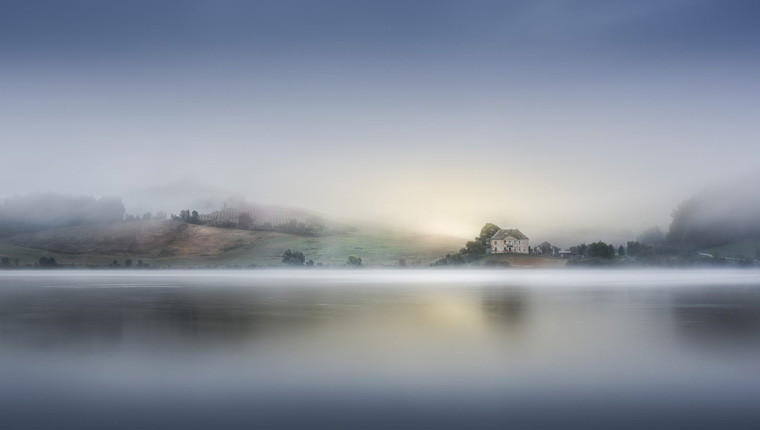
The featured photograph is by my good friend Tadej Turk. You can see more of his wonderful work here.